Brand identity
Concept: Flow
"The action or fact of moving along in a steady, continuous stream" Improving workflows so people can do their job more efficient.
Brand promise: Streamlining content workflows
We do everything we can to constantly improve and develop the workflow for our customers. We streamline workflows so people can work more efficiently, saving time, resources, and costs. Fotoware enables organizations to create more and unlock the true value of their digital content.
Brand personality: We are the experts that help create new solutions
We value our experience and use it in the best interest of our customers. We see their challenges and use our competence and imagination to think outside-the-box always challenging and creating new customer centric solutions that solves their needs.
.png)
Brand perception: Trustworthy and creative. With a bold and helpful attitude.
1. Focus on customer needs 2. Create content that is easy to understand 3. Give the right information at the right time 4. Provide friction-free customer journeys 5. Use a visual design system that supports efficiency
.png)
Logo
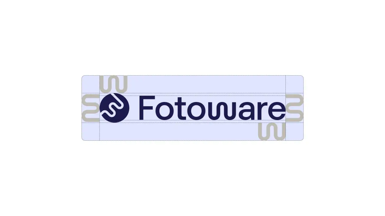
Main logo
A logo is more than just a symbol in the corner of a digital space. It should be seamlessly integrated across all products and platforms to convey the essence of the Fotoware brand through symbols and letters. Fotoware has retained the logo but revamped the font and symbol to create a unified visual concept. The W is influenced by the symbol's visual language, which adds a subtle touch. This addition honors the symbolism within our logo and suggests the idea of flow and workflows, resulting in a more comprehensive and meaningful brand narrative.
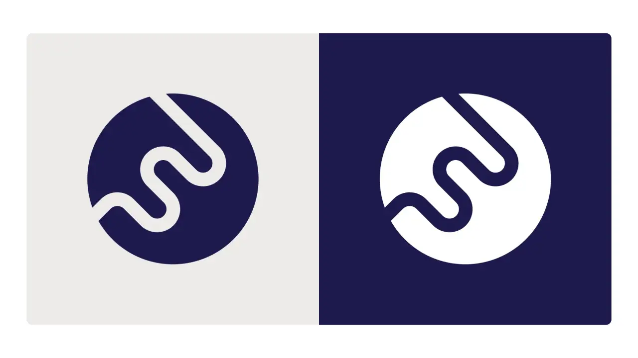
Logo symbol
Clear space
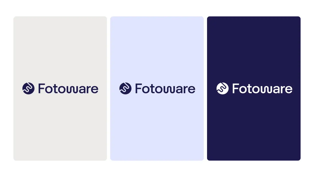
Color options
Colors
We use a simplified palette comprised of two primary colors. The green is a bright color with a medium to dark shade and a noticeable saturation, giving it a lively and fresh look. The color tone suggests growth, nature, and vitality, and conveys a sense of balance, calmness, and sustainability. While the blue color is more muted and sophisticated, it leans towards a lavender hue, and exudes a calm and serene feel. This tone is often associated with qualities like tranquility and stability. The color can be perceived as both modern and soothing, making it suitable for various design contexts, always communicating a calm and focused workflow.The palette seamlessly adapts to both dark and light modes with its warm grey and pitch-black colors, resulting in a visually appealing experience.
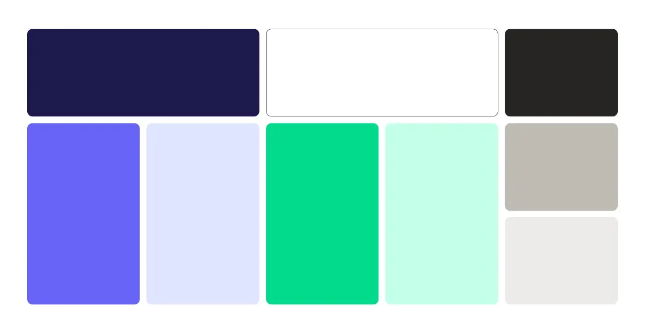
Primary colors
Dark Blue
HEX: #090140
RGB: 9/1/64 CMYK: 100/100/7/76 PMS: 275c
Blue
HEX: #6764f7
RGB: 103/100/247 CMYK: 58/60/0/3 PMS: 2125c
Bright Sky
HEX: #DFE5FF
RGB: 223/229/255 CMYK: 13/10/0/0 PMS: 2706c
Page 176009290759 Brand guidelines
Brighter sky
#eef1fc
Green
HEX #03D98C
RGB: 3/217/140 CMYK: 99/0/35/15 PMS: 2412c
Light Green
HEX: #CEFDE4
RGB: 206/253/228 CMYK: 19/0/10/1 PMS: 573c
Light Grey
HEX: #ECEBE8
RGB: 236/235/232 CMYK: 0/0/2/7 PMS: —
Secondary colors
To add more variation to the primary colors, we incorporate different tints of green and blue.
%20(2).jpg)
Typography
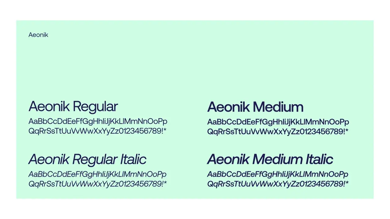
Primary typeface: Aeonik
Aeonik is a contemporary sans-serif typeface by Dunwich Type Founders. Aeonik is recognized for its distinctive and modern design, blending geometric and humanist elements to create a unique visual identity. The font exhibits a balanced combination of straight lines and subtle curves, contributing to its legibility and aesthetic appeal. It's sharp, geometric, and friendly, reflecting our personality and desire to be trustworthy, creative, and helpful. Its readability makes it effective in both print and digital environments as well as suitable for various surfaces and interfaces. Aeonik's versatility extends to various weights and styles, providing our designers with options to convey different tones and messages. For more info, email: info@cotypefoundry.com. Or visit aeonik.co.uk/font/
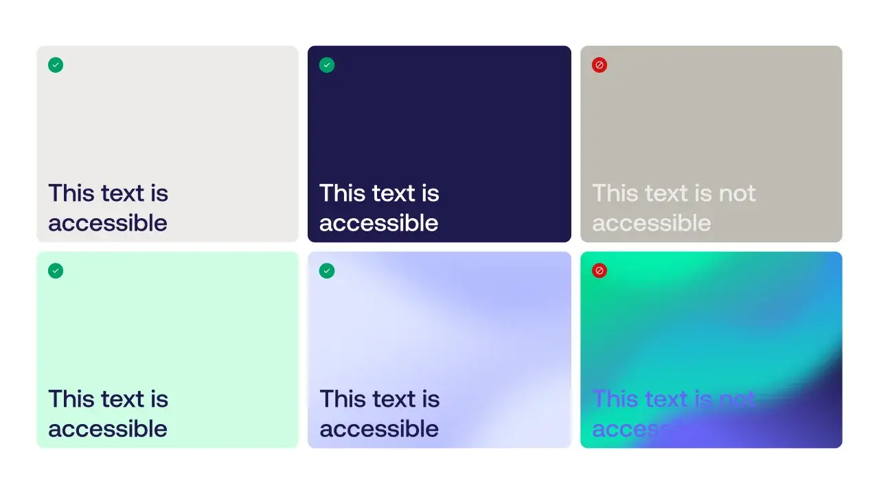
Accessibility
WCAG level AA
At Fotoware, we prioritize creating an inclusive brand experience that is accessible to everyone. For better readability, we use a high-contrast combination of dark text on a light background. We also choose fonts and spacing carefully to ensure that our brand message is legible to all. To make sure that everyone can access our content, we follow accessibility standards for color combinations and add alt text to important images and graphics. However, our brand colors may not always meet these standards due to low-contrast text and intricate patterns that can make it hard to see.
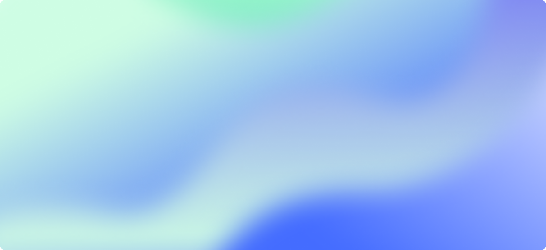
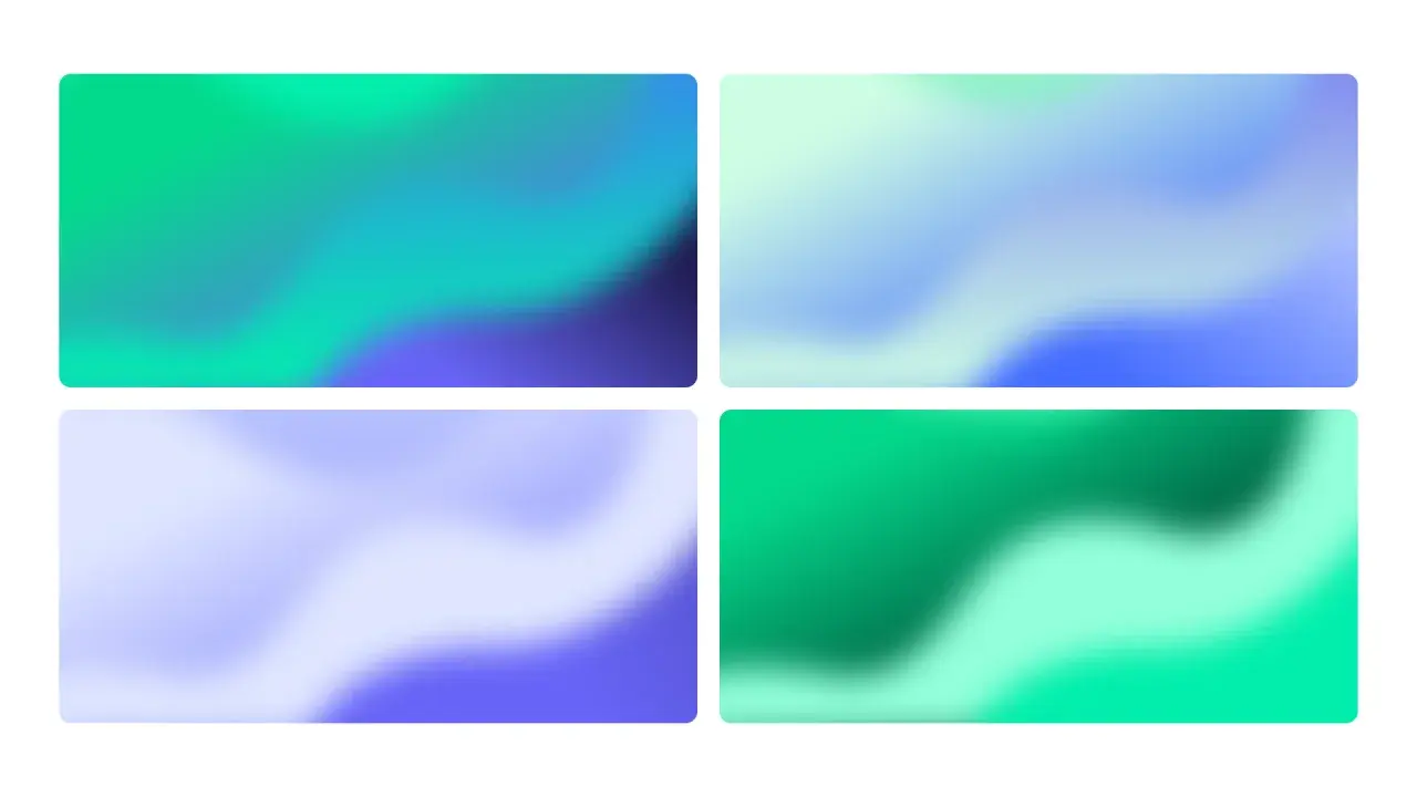
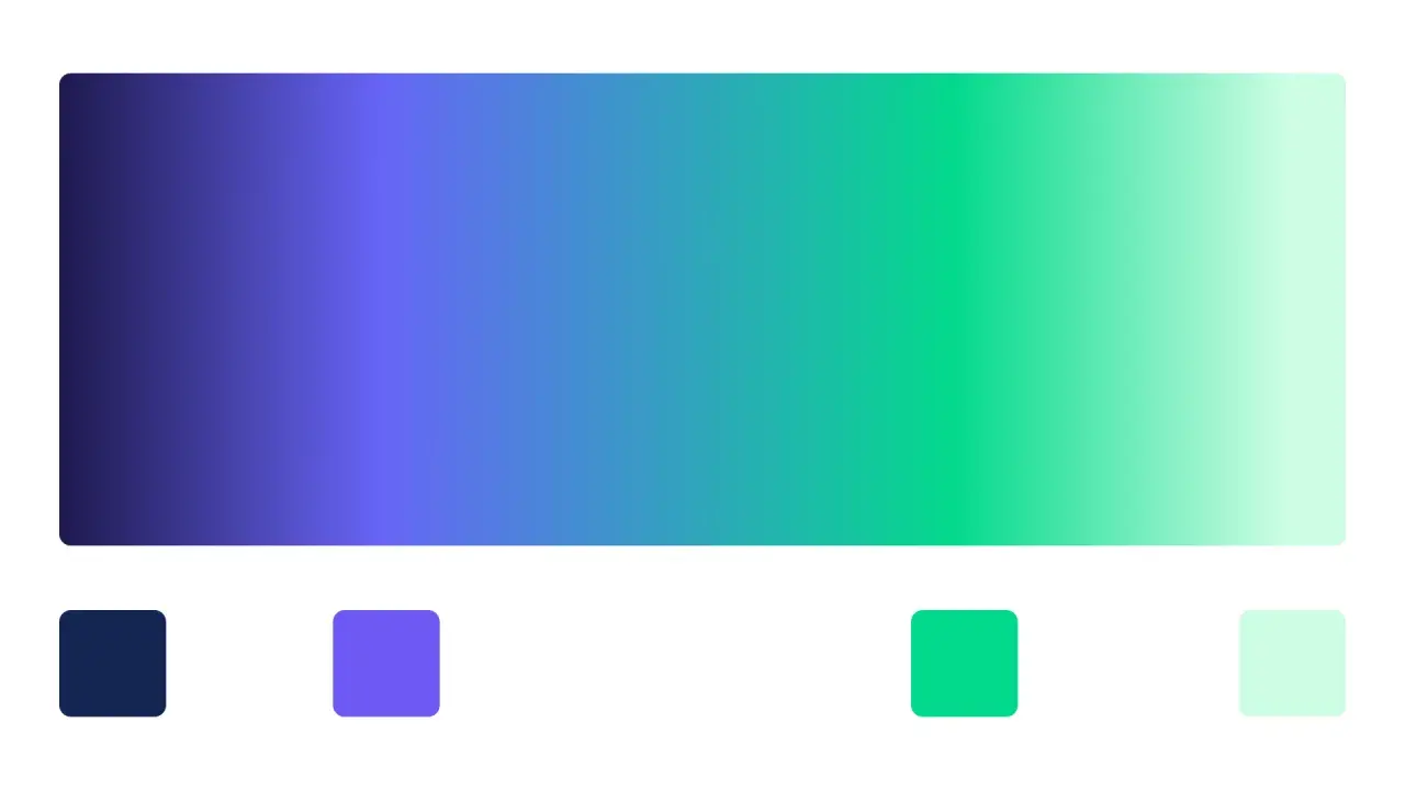
Gradients
Flow
Embracing the concept of flow, we asked ourselves: "What does a workflow look like?" Our exploration gave us highly detailed illustrations of diagrams with boxes, lines, and loops. Our approach to visualization was to move away from the complex illustrations and instead introduce abstraction in the form of gradient waves. This approach results in a softer visual impact and with a more accessible and friendly aesthetic that doesn't demand too much attention. These gradients serve a purpose beyond mere aesthetics. They can be used as backgrounds or covers, infusing life and energy into the brand. Adjusting the intensity allows for customization, ensuring they seamlessly integrate into various contexts. Used as static images or dynamic animations, they can adapt to the limitations of different mediums.
Icons
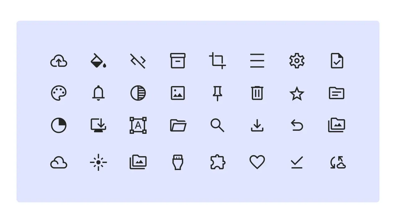
Google's Material Symbols
For icons, we use Google's Material Symbols. This is to reduce the cost of making and maintaining icons. Here we have over 3000 icons with a wide range of design variants, covering our needs for both products and websites. Symbols are available in three styles and four adjustable variable font styles (fill, weight, grade, and optical size). We use: Outlined Weight: 400 Fill: Off Grade: Normal